
A Christmas font can look lovely in a large preview and still be the wrong choice for a small vinyl decal. The best font depends on the finished project: script lettering suits short greetings, bold display styles are easier to read on signs, and decorative serifs need enough room for their details. This guide compares eight seasonal styles by appearance and likely project fit, rather than pretending that every font has been cut-tested.
Quick comparison: choose by project, not thumbnail
| Font | Style from preview | Best use | Cutting consideration |
|---|---|---|---|
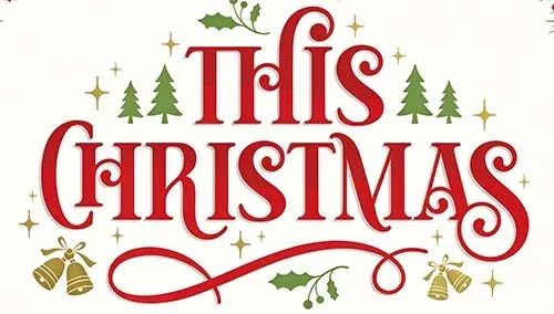
| This Christmas | Playful script with curls | Short card greetings and gift tags | Check swashes and connected joins |
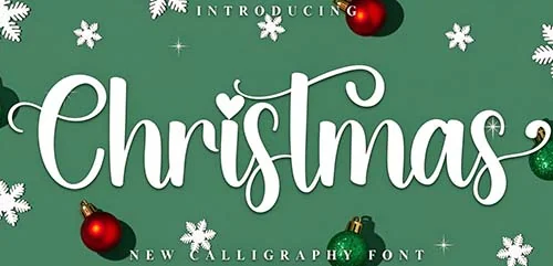
| Christmas Font | Festive handwritten display | Invitations and informal labels | Preview numbers and punctuation |
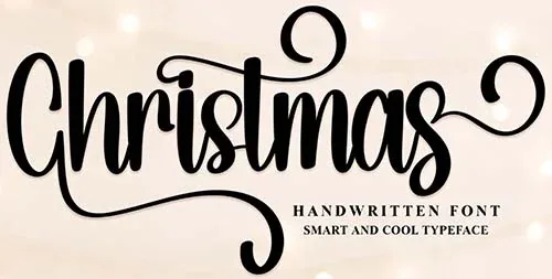
| Christmas (Handwritten) | Light handwritten lettering | Cards and personal notes | Thin strokes may need a larger size |
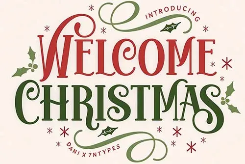
| Welcome Christmas | Bold display lettering | Signs, banners, and larger decals | Check counters and spacing in thick letters |
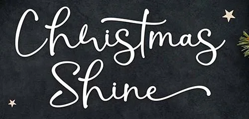
| Christmas Shine | Elegant script | Packaging and larger decorative headings | Fine strokes can be difficult to weed small |
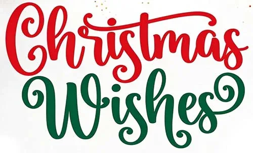
| Christmas Wishes | Delicate greeting script | Cards and gift labels | Long phrases may become hard to read |
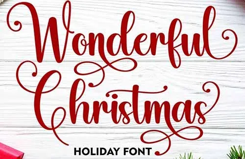
| Wonderful Christmas | Casual handwritten style | Short quotes and informal projects | Check letter joins and character set |
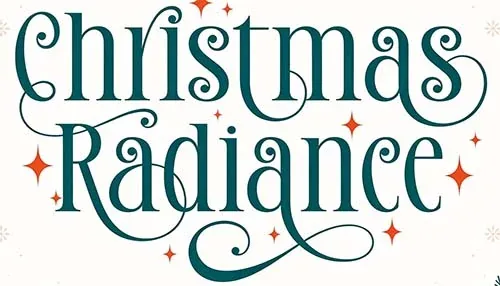
| Christmas Radiance | Modern serif with swashes | Packaging and larger labels | Swashes need room; check alternate glyphs |
Eight styles in more detail
Playful script
1. This Christmas
The listing describes a festive font with playful curls and a modern feel, and notes PUA-encoded glyphs. It is a natural fit for short greetings where a little movement adds personality. The curls are also the reason to avoid shrinking it too far.
Best use: a card heading, gift tag, or short phrase on a larger decal. Check the extra glyphs and the letters you actually need.
Handwritten display
2. Christmas Font
This handwritten decorative style is a straightforward option for seasonal headings and informal card designs. It is more useful to judge it by your own words than by the specimen image: some fonts have a complete character set, while others are designed mainly for display words.
Best use: short greetings, invitation headings, and labels. Preview numbers, punctuation, and any names before using it for personalized work.
Light handwritten style
3. Christmas (Handwritten)
The preview has a more personal, handwritten feel. That can work well for a greeting card or invitation where the lettering is meant to feel informal. Fine handwritten strokes need more space than bold display letters, especially if you intend to cut them from vinyl.
Best use: printed cards or larger lettering. For a small cut project, test the thinnest strokes before choosing this style.
Bold display lettering
4. Welcome Christmas
A bold display font is usually easier to read from a distance than a delicate script. This style is the more practical option for a banner, porch sign, or larger vinyl phrase, provided the letters have enough internal space and are not packed too tightly.
Best use: signs and banners. Check the counters inside letters such as “a,” “e,” and “o” at the final size, since small enclosed spaces can be awkward to weed.
Elegant script
5. Christmas Shine
The listing describes an elegant script with PUA-encoded glyphs and compatibility tags for common desktop platforms and cutting software. Its refined look suits packaging, stationery, or a larger decorative heading. Thin strokes and extended swashes make small vinyl applications less forgiving.
Best use: larger gift packaging, cards, or a short statement. Check alternate glyphs and test the thinnest parts before cutting.
Greeting script
6. Christmas Wishes
This style is aimed at sentimental holiday wording and decorative headings. Script fonts are most readable when the phrase is short and the letter spacing is not too tight. Long quotes can become hard to read, especially when curved around a mug or reduced for a gift tag.
Best use: a short card message or larger gift label. Preview the exact wording and punctuation rather than assuming the font supports every character.
Casual handwritten
7. Wonderful Christmas
The preview has a friendlier, more casual look than the elegant scripts. That makes it a possible fit for informal quotes, classroom projects, and family cards. Some Creative Fabrica listings for fonts with this name describe rounded, playful strokes; confirm that the linked product preview matches the style you want.
Best use: short informal messages. Check the complete character set and the joins between letters before planning a cut.
Modern decorative serif
8. Christmas Radiance
Christmas Radiance is described as a modern serif with decorative swashes. That makes it visually different from the handwritten fonts in this roundup. It can suit packaging, invitations, and larger labels where the serifs and flourishes have room to show.
Best use: a larger heading or packaging label. The listing notes extra glyphs, so preview alternate characters if you want to use the swashes. Check small-size readability before cutting.
Which font should you choose for a Cricut project?
For vinyl, start with bold or medium-weight lettering and keep the phrase short. For printed cards, you can use finer scripts because you are not weeding individual strokes from vinyl. For signs, choose a style that remains legible from several feet away. For a small gift tag, prioritize letter spacing and clear shapes over decorative flourishes.
Install and prepare the font
- Check the product page for the actual font formats and operating-system compatibility.
- Install the font on the computer or device you use with Design Space.
- Restart Design Space if the font does not appear, and make sure the font picker is not filtered to Cricut fonts only.
- Type the exact phrase and check uppercase, lowercase, numbers, punctuation, and any accented characters you need.
- For a shared SVG, convert the final text to outlines or weld the letters as appropriate. Keep an editable text copy for later changes.
Cricut's Design Space text guide explains how to select system fonts and work with text. The installed font must still support the characters you need.
License checks before using a font commercially
Do not assume a freebie label or subscription download means every type of commercial use is allowed. Read the license for each font and check client work, physical products, print-on-demand, and digital end products separately. The current Creative Fabrica subscription license is version 1.6, effective April 10, 2026. It has specific rules for Fonts and Graphics, including limits on creating new sellable designs after a subscription ends. It also prohibits sharing or redistributing the original font file.
Frequently asked questions
Are all eight fonts free?
No guarantee is made. Some listings may be offered as free downloads, while others may require a subscription or different checkout option. Check each product page at the time you download.
Can Cricut Design Space use OTF and TTF fonts?
Design Space can use system fonts installed on a compatible device. Check the current product page for the included format and Cricut's current software requirements for your platform.
Can I sell projects made with these fonts?
Only if the license covers the intended commercial use and sales channel. A license to use a font does not allow you to give the font file to a buyer or redistribute it.
Why does a script font cut poorly?
Thin strokes, tight joins, tiny counters, and small spacing can create fragile cuts. Enlarge the design, simplify the phrase, or choose a bolder font.
Bottom line: Pick the font by the finished project. The thumbnail shows style; the actual glyphs, file format, stroke thickness, and license determine whether it will work in your workflow.