
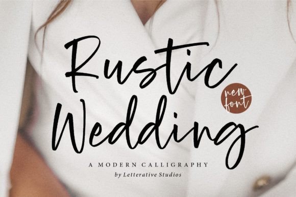
A wedding font gets judged in more places than the invitation. The same couple’s names might appear on a welcome sign, an envelope, a menu and a small place card. Rustic Wedding is a modern calligraphy font with the warmth to connect those pieces—but it works best when you build the hierarchy around readability.
Affiliate disclosure: This article contains affiliate links. TestedWise may earn a commission if you purchase through them, at no additional cost to you. Read the full disclosure.
Some product links here are affiliate links. If you use one, TestedWise may earn a commission without changing your price. We checked the specific Creative Fabrica product page on November 17, 2026; prices, download routes and license rules can change. We separate publisher claims, visible customer feedback and our practical design advice.
1. What Rustic Wedding looks like in a real stationery set
The Creative Fabrica listing identifies Rustic Wedding by letterativestudio as a modern calligraphy font suitable for crafts, greeting cards and digital designs. Its connected, casual strokes make it a plausible accent for a romantic, garden-style or rustic wedding rather than a full-page text font.
Think of the script as the personality of the set. Use it for “Emma & Noah,” the wedding date or a short welcome line. Set venue addresses, directions, meal choices and long instructions in a plain, readable companion typeface. Your guests should not have to decode a script to find the ceremony time.
- Couple’s names: the script is the hero at a generous size.
- Date, venue, RSVP details: choose a high-legibility serif or sans-serif.
- Place cards: preview each actual guest name at final physical size.
- Long menus: reserve the script for headings rather than course descriptions.
2. Pair the calligraphy without making the invitation fussy
An easy two-font system is often better than a complicated three- or four-font palette. Set the names in Rustic Wedding, pair them with a quiet serif for the venue and date, then use spacing and font weight instead of additional decorative fonts to create hierarchy.
Test the longest guest name and the widest venue line before finalizing the card. A short name can look beautifully balanced in a specimen but a compound surname may extend into the margin. Consider a bit more line spacing around the script: ascenders and descending strokes need room to breathe.
- Set one script line, one companion text family and no more than two type sizes for short cards.
- Print a draft at 100% size; do not judge tiny text from a zoomed screen.
- Leave comfortable edge clearance for home trimming and print registration.
- Export a print PDF at the correct paper size and embed or outline fonts if your workflow requires it.

3. Make a welcome sign or place card with a cutting machine
For a large welcome sign, connecting script may be a useful advantage: some letters touch naturally, reducing the number of separate vinyl shapes. But neither the listing nor the preview verifies that every pair joins perfectly. Check the exact names and inspect letter overlaps before cutting.
In Cricut Design Space, install the font on your computer and use it as a system font. Work at the real sign dimensions, adjust spacing manually and test the smallest counters. A connected brush-like stroke can still contain fine parts that tear when weeded too small. For small place cards, printing may be quicker, cleaner and easier to repeat than cutting intricate names.
- Use the final-size layout, not a large placeholder artboard.
- Inspect joins between letter pairs and separate dots above i or j.
- Cut one name at the intended size with the actual vinyl before making fifty.
- For intricate place cards, print rather than cut if the lines are too delicate.
4. What the listing confirms—and what it does not
The product page lists Windows, Mac, Linux, Cricut and Silhouette under compatibility. It shows a specimen and glyph section, but the public description does not specify exact file extensions, alternate letter sets, full multilingual coverage or a complete punctuation inventory. Do not assume a decorative swash set or specific accented characters are included without checking the specimen or the download.
The page displays a free-download headline while separately stating that the item is part of the subscription catalogue. It promotes a free-trial allowance; the listing does not currently present a standalone no-trial freebie route. A wedding print deadline is not the time to discover that the expected font is only available through a plan.
- Preview the actual couple’s names, hyphens, apostrophes and accents.
- Check whether your printer or invitation vendor needs outlined or embedded font files.
- Keep a clear record of the license used for commercial stationery sales.
- Compare the ongoing subscription with your need for this single typeface.
View the exact Rustic Wedding font on Creative Fabrica →
5. Who should use Rustic Wedding?
The listing showed a 5.0 average from five reviews at our check date. The comments are positive and describe the font as attractive and easy to return to, but a five-review sample is not evidence of measured print quality or Cricut performance.
Our verdict: Rustic Wedding is a reasonable candidate for names, invitation headings and warm event signage if your design uses a readable supporting font. It is less suitable as the only font on a dense itinerary or a very small cut-vinyl place card. We have reviewed the public product page, not installed the typeface or produced a printed wedding suite.
6. License and download checklist
The product page says this font is available as part of Creative Fabrica’s subscription. The “free download” headline refers to a promotional offer, not confirmed perpetual no-trial access. Check the trial terms, renewal price, what happens on cancellation and which license applies to your intended commercial projects before downloading.
Font licenses can treat physical end products, digital templates, logo use, embedding and print-on-demand differently. Keep the applicable license with your project files, and never redistribute the source font in a customer download unless the license specifically allows it. The two official Creative Fabrica license pages below describe different acquisition routes; the one attached to your download controls.
- Confirm you are on the exact product page and designer, not a similarly named font.
- Preview the full glyph panel with any punctuation and accented characters your project requires.
- Inspect the downloaded file formats and install only trusted files from the official source.
- Test real-size legibility, print output or cutting behavior before making products to sell.
Check Rustic Wedding download & license on Creative Fabrica →
7. Frequently asked questions
Is Rustic Wedding a script or a serif font?
It is listed as modern calligraphy, so treat it as decorative script primarily for headings and names.
Can I use it for a wedding invitation?
Yes as a design choice; pair it with a readable text font for dates, venue details and response information.
Will it cut well on a Cricut?
The listing includes Cricut compatibility, but thin joins and tiny dots should be tested at the actual cut size.
Does it include accented letters and swashes?
The public description does not confirm a full multilingual or alternate-glyph inventory. Preview your specific characters and inspect the downloadable files.
Can I use it for guest place cards?
Yes, especially if printed. For vinyl place cards, test the longest and smallest names before committing.
Is this particular Rustic Wedding font free without a trial?
The listing identifies subscription access and a trial promotion, not a separate no-trial freebie option.
More creative lettering guides
For a wider comparison of seasonal lettering styles, see our Christmas fonts for Cricut guide. For another font with a different design role, explore the Cute Cat decorative font, or return to Creative Assets & Templates.